

The Hidden Logic Behind Experiences People and Companies Love
Shannon Kennedy, Design Lead at SEEK, joined the Women in Digital community to share a practical framework for designing digital experiences that go beyond just functional, to genuinely valuable.
We’ve all been on both sides of this. You open an app or website, it works fine, but nothing sticks. Or you discover something and find yourself back the following week, and the week after, without quite being able to explain why. What’s the difference? That’s the question Shannon Kennedy has spent her career helping other tech leaders answer.
Design is more than what you see on the screen
Most of us interact with the visual layer: colours, typography, imagery, animation. But underneath that sits the interaction design and logic, the behavioural system that manages cognitive load, guides users toward an outcome, and makes the whole thing feel smooth or broken.
Good design, Shannon argued, uses the visual layer to provide clues (affordances) about how the underlying logic works. The surface communicates the system. When those two things aren’t aligned, users feel confused without knowing why.
Two ideas anchored Shannon’s Masterclass. First: when an experience feels meticulously made, the user feels personally valued, and that transforms a transactional product into something people return to by choice. Second: great design isn’t a balancing act between user needs and business goals. It’s the bridge that makes both possible at the same time.
Ambiguity isn’t a problem to solve. It’s how you demonstrate leadership.
Shannon drew a distinction that’s worth holding onto. For customers, ambiguity kills conversions. When users can’t immediately understand what to do or why it matters, they leave. Good visual design, she said, acts as a roadmap for the eyes.
For design teams, ambiguity looks different. It shows up as unclear problems, shifting constraints, incomplete data, conflicting prioritisation, and multiple stakeholders with different definitions of success. This is the environment in which most digital product work actually starts.
Shannon’s position: waiting for clarity that is never coming is where teams get stuck. Ambiguity is the way in which you can demonstrate leadership, influence direction, and create meaningful outcomes for customers. The ability to move from uncertainty toward defined problems, aligned stakeholders, and tangible success metrics isn’t a nice-to-have. It’s core to the job.
The Creative Clarity Funnel
To help teams navigate ambiguity well, Shannon introduced her Creative Clarity Funnel, a framework for moving from uncertainty to confident design decisions across three stages.
Curiosity is the discovery phase. The mindset here is wide lens, flexible, questioning, and comfortable with the messy. The goal is to understand the problem before jumping to solutions. Shannon’s toolkit includes desk research (Business Model Canvas reviews, OKR and KPI alignment, competitive analysis), lean methods like the Five Whys and assumption mapping, and exploratory customer research. The output: a clear problem statement, the user’s job to be done, and a “how might we” question to work from.
Connection is about making sense of what you’ve found. The mindset shifts to critical, analytical, and synthesising. Teams pull data into themes, document clear hypotheses linking insights to potential design interventions, and run evaluative research to test their thinking. Shannon’s principle here: sensemaking over data-dumping.
Clarity is about committing to a path. Simplifying, refining, less is more. The hypothesis gets socialised with the team, a lightweight prototype is built, and the design reasoning gets connected back to both customer goals and business outcomes. The principle: simplicity and intentionality.
Shannon was clear that this framework isn’t about finding the “right” answer. It’s about reducing the fog until the path becomes clear.
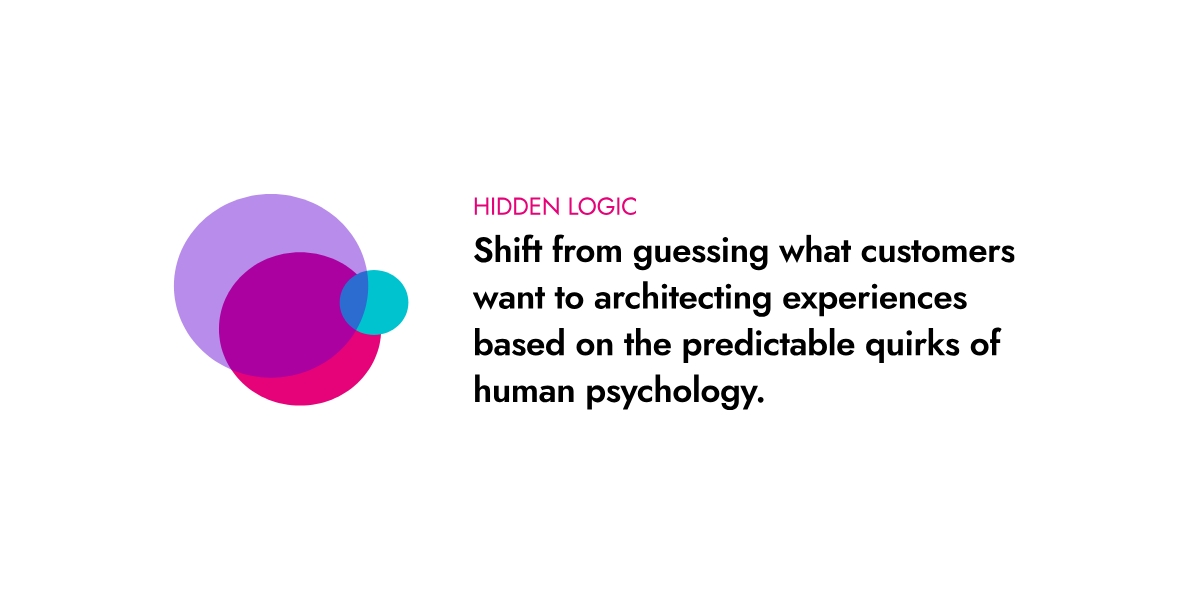
Your users’ brains are running a cost-benefit analysis on every interaction
Shannon introduced a framework for mapping user flows using two forces that shape every interaction. The first is cognitive friction: how much mental or physical effort the user has to expend, whether that’s filling in fields, parsing unclear navigation, or making sense of data. The second is perceived reward: how much psychological or functional value the user feels they’re getting, whether that’s status, validation, time saved, or instant gratification.
Plotting those two areas produces four zones. The Abandonment Zone is high friction with low reward (think lengthy sign-up forms with nothing compelling at the end). The Illusion Zone is low friction with low reward, where the user moves through quickly but walks away without anything of value. The Utility Zone is high friction with high reward, something like banking, which is functional but often painful. And then there’s the Delight Zone: low cognitive load with instant, personalised reward. Shannon describes this as where the hidden logic lives.
About Shannon Kennedy
Shannon Kennedy is Design Lead, Ad Products at SEEK. With a background spanning graphic design, print production, growth product design, eCommerce, education, FMCG and SaaS, she combines commercial rigour with a genuine commitment to mentoring the next generation of designers. Shannon is passionate about communicating design impact and helping teams connect their design choices to real business outcomes.
This masterclass was hosted as part of the Women in Digital members’ webinar series. Want access to sessions like this? Learn more about WID membership.